Monitor Near Real-Time State/Status
Monitor the near real-time state/status of your applications from the Application view widgets ensuring a seamless experience.
AppViewX recommends to enable Syslog-based configuration updates for near real-time monitoring. Refer to Installation Guide for enabling Syslog configuration.
You can enable the below options in the Dashboard settings for near real-time monitoring. For Dashboard setting, see Dashboard Setting section.
-
Refresh on load - Enables Refresh on load from the
 (Settings) of
the dashboard page to get the latest state/status information on loading the
dashboard.
(Settings) of
the dashboard page to get the latest state/status information on loading the
dashboard. -
Last Refresh time - Displays the last time the widget is updated with the latest State/Status information.
-
Refresh - Click the Refresh button on the widget to perform on-demand State/Status information. Each Object contains a last refresh time on the tooltip, you can also trigger a refresh for a particular object from the tooltip.
-
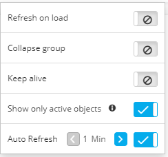
Collapse group - If this setting is enabled, each time the dashboard loads, all groups within widgets on the dashboard display in a collapsed state by default.
-
Collapse hierarchy - If this setting is enabled, each time the dashboard loads, all object hierarchy within widgets on the dashboard display in a collapsed state by default.
-
Keep Alive - This option is available in the dashboard settings . If this option is enabled, it ensures the session is not timeout by
refreshing the dashboard every 15 mins.
-
Show only active objects - If this option is enabled, only the active objects are displayed within the widget.
Example, in the following sample application widget,
-
all of the objects in the widget show that they are in an Enabled state-they all have hollow circles beside their names
-
one of the InternalDMZ-Members objects is offline, so it shows a red square beside its name, indicating its Offline status.
-
Three of the other objects display gray squares, indicating their Unlicensed/None/Failure States status.
-
The temperature bar, which is the colored bar at the top of each group or object name, displays the overall status of all components within the widget. In the example above, note that the virtual server group shows a solid green temperature bar because all components under it are Available, whereas the Members group shows a mostly green bar transitioning to red, to indicate that some of the components within it are Unavailable. Hover your cursor over the color in the temperature bar to see the number of components that have the corresponding status.