| Widget header |
Allows you to rename the widget header. |
| Select icon |
Allows you to select an icon for the widget from the
options available in the dropdown. |
| Description |
Allows you to add a description for the widget. |
| Grid Universal Controls |
Allows you to enable/disable the following:
- Search:Turn off the toggle for Search if you
don’t want the Search bar to be displayed in the
grid. Enabling the Search bar allows you to quickly
search for a particular item in the grid.
- Pagination: Turn on the toggle for Pagination
to display the number of records that can be viewed
on a page. Enabling Pagination allows a page with
high volumes of data to load faster.
- Actions: Turn off the Actions toggle if you
don’t want the Action buttons to be displayed in the
grid. Enabling action buttons such as Add, Edit, and
Delete allows you to quickly perform these actions
and modify the grid.
|
| Hooks |
Allows you to assign an appropriate hook for this
field.
- Select a hook that is relevant to the form
field.
- Hooks can be either Script or REST API.
- Hooks are used to fetch details against a specific
form field from the device and/or database and map
them to the respective field on the user
interface.
Note: For more information on
Adding Hooks to Form Fields, click here.
|
| Column Preferences |
Allows you to configure the columns in the grid. |
 .
.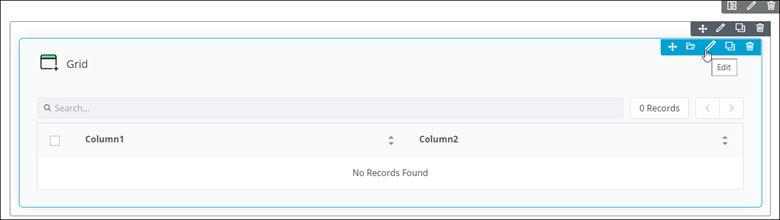 The Grid pop-up window opens with the Properties tab open by default.
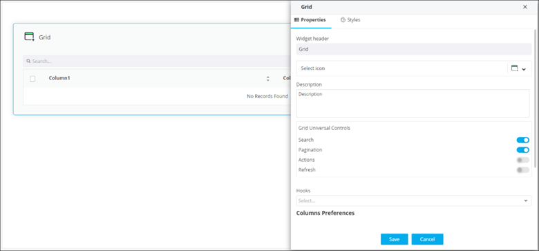 The following table describes the options under the Properties tab: