Configure a Heatmap Widget
- CPU Utilization - Total usage of CPU in percentage along with the unused CPU limit
- Memory Utilization - Used memory space in percentage
- Bandwidth Utilization - Total bandwidth limit along with the used bandwidth percentage
- Device Information - Statistical information including expiry date, vendor, version, and uptime
- Alarms - All alerts corresponding to each device included in the heatmap
- Logs - All logs corresponding to each device included in the heatmap
- Graph - Displays the current connections for each device included in the heatmap
- iHealth reports (F5 devices only)
In the Heatmap widget, ADC device groups appear as color-coded blocks, with the colors representing the following:
- Green - All devices in the group are healthy
- Red - At least one device in the group is in a critical state
- Gray - Statistics have not been collected for the device group.
- Orange - One or more devices in the group have reached a warning limit
To configure a Heatmap widget on your dashboard, complete the following steps:
-
If you are creating a Heatmap widget as part of creating a new dashboard, complete the
steps in theCreate a Dashboard topic above,
then jump to Step 5 below. If you are creating a Heatmap widget for an existing dashboard,
click
 in the Command bar
of the dashboard.
in the Command bar
of the dashboard.
- On the Create widget screen that pops up, select Custom as the widget type.
- Enter a name for the widget.
- In the Basic charts field of the Settings screen, click the Heatmap option.
- In the Filter query field, click the groups you want to include in the heatmap.
-
Click Next.
A Heatmap widget configuration screen appears.
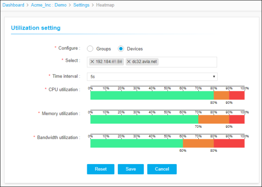
- In the Configure field, select the Groups or Devices radio button depending on whether you want the heatmap to show data for device groups or individual devices.
- In the Select field, click the dropdown arrow and select each of the groups or devices you want to include in the heatmap.
- In the Time interval field, select the frequency that you want the system to check the utilization levels of the devices or groups you selected in Step 7.
- In the CPU Utilization field, click and drag the sliders to define the safe, warning, and critical value limits for device CPU.
- In the Memory Utilization field, click and drag the sliders to define the safe, warning, and critical value limits for device memory.
- In the Bandwidth Utilization field, click and drag the sliders to define the safe, warning, and critical limits for device bandwidth.
-
When you are done configuring the heatmap settings, click Save.
The heatmap widget then displays on the dashboard, with separate, color-coded blocks representing the following for each of the devices or groups you selected.
- Green - CPU, memory, or bandwidth usage within safe limits.
- Orange - CPU, memory, or bandwidth usage within warning limits
- Red - CPU, memory, or bandwidth usage within critical limits
- Gray - Missing or no information for the related group or device
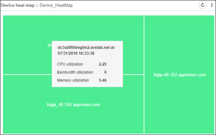 On hovering your cursor over a device or group, the following information appears in a popup tooltip:
- Current CPU utilization for the device/group
- Current bandwidth utilization for the device/group
- Current memory utilization for the device/group