Configuring the File Upload field - Properties
- To add the File Upload field to your form, drag and drop the File Upload component to the design canvas.
-
To configure the File Upload widget, hover your mouse over the widget
and click
 .
The File Upload pop-up window opens.
.
The File Upload pop-up window opens.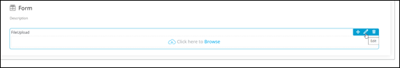
-
In the File Upload window, under Properties, enter or select the
required fields.
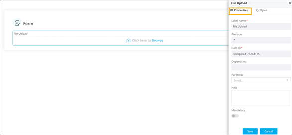 The following table describes the fields under the Properties tab:
Field Description Label name Enter a valid Label name for the form field. For example, Chose File. File Type Allows you to define the type of file(s) that can be uploaded. For example, if you enter .* as the file type, it means any file type can be uploaded to this field. Alternatively, you can define the file types as .png, .svg and so on. Field ID* Allows you to assign a unique Field ID to refer to the field name. - Allowed characters: ‘-‘ and ‘_’
- Character Length: Min (1), Max (50)
Global variable Allows you to define this field as a Global Variable. Depends on Allows you to define dependencies between form fields based on ‘Field ID’ and ‘Values’.
- Operators used: ‘&’ and ‘|’
- Max character: 550
- Format: [Field Id1: value1 & Field Id2: value1 & Field Id3: value3], [Field Id1: value1 | Field Id2: value1]
Parent ID Allows you to assign a Parent ID for fields in a table.
- Select the relevant tabular component (Field ID) against which the form field must be mapped to.
Note: This is used only when defining a tabular element in the form.Help Allows you to add Help text/tooltip for the field. Mandatory Allows you to define this field as Mandatory or otherwise. If marked as mandatory, an asterisk (*) is displayed next to the field name in the form. Read only Allows you to define this field as Read Only or otherwise. If marked as Read Only, a red crossed circle is displayed when you hover your mouse over the read only field and does not allow you to enter any information. - Click Save.
-
To browse for files to be uploaded from your machine to the page, click
 .
.