Configuring Grouping in the Card Widget
-
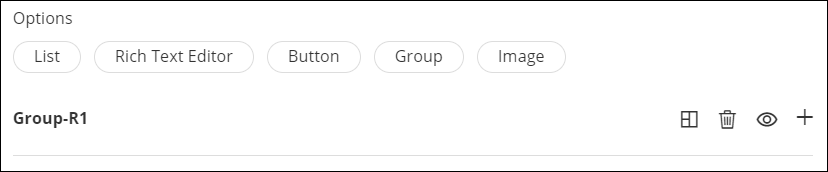
In the Card window, in the Properties tab, under Options,
click Group.
The Group row is displayed.
-
To expand the row and add a list, click
 .
A new row is displayed with the default name as Group1. You can rename this by typing over the existing name.
.
A new row is displayed with the default name as Group1. You can rename this by typing over the existing name.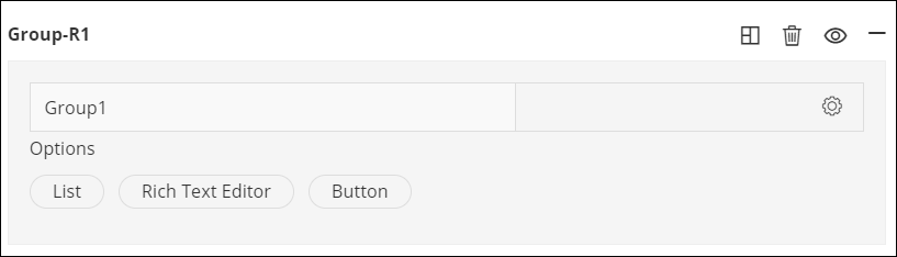
-
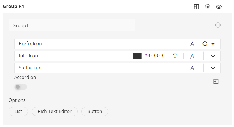
In the List1 row, to configure the list, click
 .
The following options are displayed as shown in the screenshot below.
.
The following options are displayed as shown in the screenshot below.- Prefix Icon
- Info Icon
- Suffix Icon
- Accordion
 The following table describes each
option available here:
The following table describes each
option available here:Option Description Prefix Icon - To add a prefix icon next to the list
name, click
 and select the required
icon from the options available.
and select the required
icon from the options available. - To increase or decrease the size of the
prefix icon, click
 and set the icon
size.
and set the icon
size.
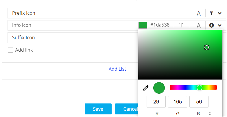
Info Icon - To add an Info icon next to the list name,
click and select the required
icon from the options available.
- To increase or decrease the size of the
Info icon, click and set the icon
size.
- To select a color for the info icon, click
the color picker box and select the required
color.
- To add info text, click
 and enter the text in the
textbox.
and enter the text in the
textbox.
Suffix Icon - To add a suffix icon next to the list
name, click and select the required
icon from the options available.
- To increase or decrease the size of the
suffix icon, click and set the icon
size.
Accordion Allows you to hide or show large volumes of content in the card widget by turning this toggle on or off. You can select icons to Expand and Collapse the content in the card widget and also set the placement of these icons. - To add a List, Rich Text Editor, or Button in the Group, click on the respective link under Options.