Configuring the Card - Properties
- From the Build component in the left menu, under the Widgets section, drag and drop the Card widget to any blue highlighted space on the page.
-
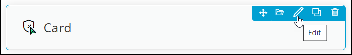
To configure the Card widget, hover your mouse over the widget and click
 .
. The Card pop-up window opens with the Properties tab open by default.
 -
In the Card widget window, under Properties, enter or select the
required field information.
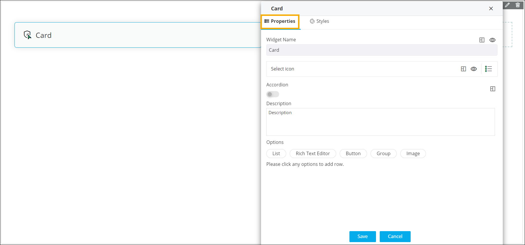 The following table describes the options under the Propertiestab:
Field Description Widget Name Allows you to enter the name for the card widget. Styling options available for the Widget name are:  - Allows you to align the
widget name to the left, right, center of the
widget.
- Allows you to align the
widget name to the left, right, center of the
widget.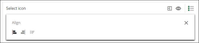
 /
/ - Allows you to show or
hide the widget name.
- Allows you to show or
hide the widget name.
Select icon Allows you to select an icon for the widget. Styling options available for the icon are: - - Allows you to align the
icon to the left, right, or adjacent to the widget
name.
- / - Allows you to show or
hide the icon.
Accordion - Turn this toggle on or off to hide or show large volumes of content in the card widget.
- Turning the toggle on displays options to select icons to Expand and Collapse the content in the card widget.
- Click to align the Expand and
Collapse icons to the left or right of the
widget.
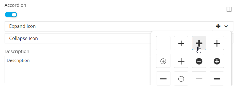
Description Allows you to add a description for the card widget. Options Allows you to add the following components to the card widget: - List
- Rich Text Editor
- Button
- Group
- Image
- Click Save.