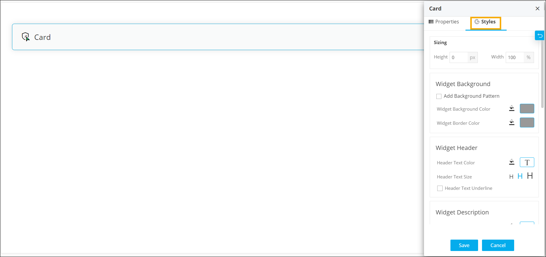
| Sizing |
Allows you to increase/decrease the height and
width of the widget. |
| Widget Background |
The following options are available here:
- Add Background Pattern: To add a
background pattern to the widget, select the Add
Background Pattern checkbox and select a
pattern from the available options.
- Widget Background Color: To add a
background color to the widget, deselect the Add
Background Pattern checkbox and select the
color from the color palette.
- Widget Border Color: Allows you to
change the color of the widget border.
|
| Widget Header |
The following options are available here:
- Header Text Color: Allows you to
change the color of the header text.
- Header Text Size: Allows you to
select the size of the header text.
- Header Text Underline: To underline
the header text, select the Header Text Underline
checkbox.
|
| Widget Description |
The following options are available here:
- Label text Color: Allows you to
change the color of the label text.
- Label Text Size: Allows you to
select the size of the label text.
|
| Icon Style |
Allows you define the following style settings:
- Icon Color - You can select the
color for the icon from the available options.
- Icon Background - You can select
the background for the icon from the available
options.
- Icon Background Color - You can
select the background color for the icon from the
available options.
|
| Widget Layout Style |
Allows you to define the padding and margin of
the Card widget. |
 The following table describes the options available under the Styles tab: