|
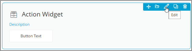
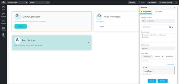
Widget Header
|
Allows you to enter the widget header name. |
| Select icon |
Allows you to select the icon for the widget from the
options available in the dropdown. |
|
Description
|
Allows you to add a description for the action
widget. |
|
Button text
|
Allows you to add the text that is
displayed on the button. |
| Add links |
Allows you to add links to the action widget. The
following options are available here:
- Internal: Add an internal
from within AppViewX pages.
- Others: Add links to
other pages within AppViewX or embed external
cross origin enabled pages.
- Workflow: Add a workflow
link which redirects to the workflow execution
page.
|
 .
.