Configuring the Button/Action Widget - Styles
-
For more options to customize the action widget, in the Button
window, click Styles.
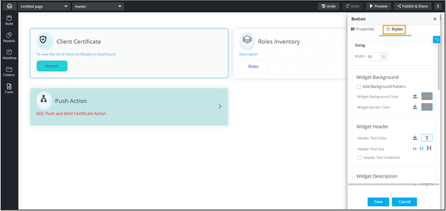 The following table describes the options available under the Styles tab:
Option Description Sizing Allows you to increase/decrease the width of the action widget. Widget Background The following options are available here:
- Add Background Pattern: To add a background pattern to the widget, select the Add Background Pattern checkbox and select a pattern from the available options.
- Widget Background Color: To add a background color to the widget, unselect the Add Background Pattern checkbox and select the color from the color palette.
- Widget Border Color: Allows you to change the color of the widget border.
Widget Header The following options are available here:
- Header Text Color: Allows you to change the color of the header text.
- Header Text Size: Allows you to select the size of the header text.
- Header Text Underline: To underline the header text, select the Header Text Underline checkbox.
Widget Description The following options are available here:
- Description text Color: Allows you to change the color of the label text.
- Description Text Size: Allows you to select the size of the label text.
- Description Text Underline: To underline the description text, select the Description Text Underline checkbox.
Widget Type Allows you to enable/disable the button in the action widget.
- To enable the button select the Enable button checkbox.
- To disable the button, deselect the Enable button checkbox. The action widget is displayed in a card view. Click on the widget to redirect to the page that is linked to the widget.
Button Background This feature is available only when the button is enabled. The following options are available here:
- Button Corners: Allows you to define the curvature of the button corners. The higher the number, the corners will be curved more.
- Button Alignment: Allows you to define the placement of the button in the action widget - left, center, and right.
- Widget Background Color: Allows you to select the background color of the widget from the color palette.
- Widget Border Color: Allows you to select the color of the widget border from the color palette.
Button Text This feature is available only when the button is enabled. The following options are available here:
- Button Text Alignment: Allows you to define the placement of the button text inside the button - left, center, and right.
- Button Text color: Allows you to select the button text color from the color palette.
- Text Size: Allows you to select the size of the text displayed on the button.
Icon Style The following options are available here: - Icon Color - Select the Icon Color from the available options.
- Icon Background - Select the Icon Background from the available options.
- Icon Background Color - Select the Icon Background Color from the available options.
- To save your settings, click Save.
-
To restore the settings under Styles to default, click
 .
.